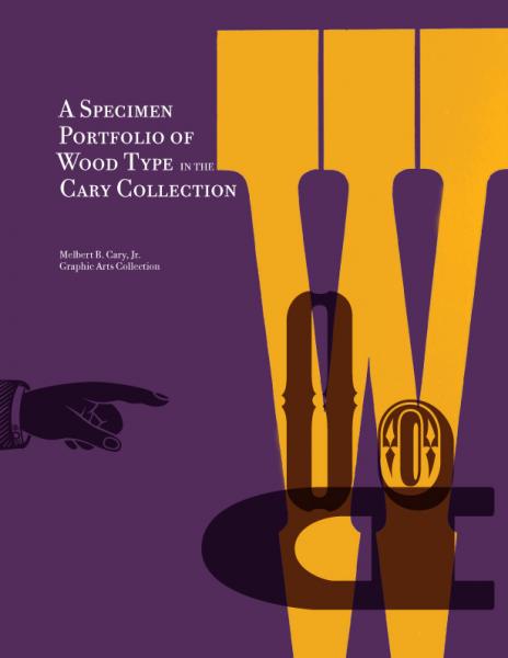
Foreword by R. Roger Remington, Curator’s Note by David Pankow, and Introduction by David P. Wall, whose master’s thesis forms the basis of the work.
This is a fascinating book providing an interesting cross-section of wood type fonts. It is at once a valuable record of what was saved as well as a testament to how tenuous the survival of many of these types was and a memoriam of how much was lost—showcasing 412 out of some 20,000 wood type fonts which are believed to have existed.
Although the book references many other publications and has an excellent bibliography, it is a stand-alone work, suitable for even a beginning graphic designer, typographer or student. Rather than rely on an external classification system, the types are cataloged in accordance with a scheme modeled on an ISO standard (9541-1, Annex A, Electronic Font Interchange) which is presented in its entirety at the beginning of the book. These classification pages represent a useful text in and of themselves, providing at once a broad overview and specific notes on typeface forms.
Types are shown on spreads, one or more fonts per spread, with the verso being used for an expansive actual-size exemplar (save for a few fonts which are too large even for a full-page showing) and identification and sizing notes, while the recto shows a complete sample of the fonts in the collection—in many instances, a complete alphabet, the classification, identification and notes on the manufacturer and date. It is the incomplete showings which are most interesting, however, offering fascinating glimpses into how the typefaces were actually used, or how it is that they might have been saved from destruction (AUCTION on pg. 19, a dollar sign and set of numerals on pgs. 75, 79 and 101, six letters which might spell out “TOUCAN” on pg. 129).
Younger designers and students will be surprised at the variety of the typefaces, their not being limited to just the stereotypical condensed slab serifs of Hollywood Western “Wanted” posters and encompassing many designs not represented in Adobe’s Wood Type Font Collections. Old hands will be pleased to see what has been preserved and may be moved to search through some old drawers or storage chests and find some pieces to donate and share. Although Rochester Institute of Technology plans to eventually provide online access to digital images, the immediacy and ease of reference of this excellently organized text makes purchasing the very affordable print version an easy decision.