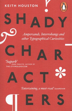
Keith Houston, Shady Characters: Ampersands, Interrobangs and Other Typographical Curiosities. Penguin; 2015, xiv+340pp, ill. Softcover. First published by Norton in 2013. £9.99. ISBN 978-0-718-19388-1. http://books.wwnorton.com/books/Shady-Characters/
Keith Houston, The Book: A Cover-to-Cover Exploration of the Most Powerful Object of Our Time. Norton; 2016, xviii+428pp, ill. Hardback. First edition. $29-95. ISBN 978-0-393-24479-3. http://books.wwnorton.com/books/detail.aspx?ID=4294990748
To my chagrin these are books that I had not heard of until I was asked if I would like to review them. I answered in the affirmative and am very glad that I did so, as I have thoroughly enjoyed reading them while also learning a great deal.
In Shady Characters the author Keith Houston, who hails from the UK, has written with a twinkle in his eye about the fascinating history and use, or not, of punctuation marks, delving back to the time of the great library at Alexandria.
For instance, Aristophanes of Byzantium, a 3rd century bc librarian at Alexandria introduced a system of dots (...) to indicate the length of pauses a speaker should make when reading aloud. The intermediate dot (.) was used for a short pause after the komma rhetorical unit, the low dot (.) for a medium pause after the kolon unit and the high dot (.) for a long pause after the periodos unit. In time these became the now familiar comma (,) and colon (:) and period (.) marks. I had always wondered why a (.) was called a full stop in the UK but a period in the USA, and this explains the latter. For the former the 2nd century bc grammarian Dionysius Thrax wrote:
... the full [or high dot (.)] ... marks the completion of the sense ...
which presumably lead to the term ‘full stop’.
¶ As Houston explains in his preface, it was the pilcrow (¶), though rarely used now, that first caught his attention. Early writing used no punctuation running all the words, sentences and paragraphs together with not a space to be seen. Gradually the idea of delineating the words by inserting spaces between them took hold. The pilcrow was later introduced to indicate the start of a paragraph, at first within a line but later as the first character of a paragraph which was started on a new line. In medieval times the pilcrow was usually rubricated (coloured red) to enhance its visibility.
¶ When printing started, a space was left at the start of paragraphs for a hand rubricated pilcrow to be inserted later. Then as more and more documents were printed and costs had to be minimised the pilcrow, as the author states, ‘[It] committed typographical suicide.’ The rubricators were thrown out of work but the initial space at the start of paragraphs remained. Thus the initial indentation of the first line of a paragraph.
Houston is a brave man in that he criticised Robert Bringhurst’s explanation in his The Elements of Typographical Style of the octothorpe (#) as:
…In cartography, [#] is a traditional symbol for village: eight fields around a central square. That is the source of its name. Octothorpe means eight fields.
Houston says that typographically speaking, the octothorpe came into being by scribes in the 14th century as a hastily scrawled form of ‘lb’ (for libra or ‘pound in weight’). Nowadays it has many names and uses, the most common being pound sign, number sign and hash tag, and in music notation, the sharp (♯) sign.
Altogether Shady Characters treats ten symbols with, typically, a chapter devoted to each. The ones not mentioned so far are: the interrobang (!?) which was created by Martin Speckter in 1962 to convey a mixture of surprise and doubt but to my relief appears to be going out of fashion; the ampersand (&) derived from the Latin et meaning and; the commercial at symbol (@); a chapter on the asterisk (*) and dagger (†) symbols which are used to indicate footnotes;1 two chapters on the hyphen (which includes six pages about TeX) and other dashes; the manicule (☞);2 and quotation marks (“ ”). There is a further chapter on possible marks to indicate irony or sarcasm.
Houston says that the manicule is not much used nowadays but he uses it as the first character in the captions to the illustrations, which are plentiful. Many of them are reproductions of manuscripts and early printing; unfortunately, the contrast in these between the characters and the background is low. In a few of them I had difficulty, even after using a magnifying glass, to make out the symbols being illustrated.3
Shady Characters is set in Hoefler Text but many other fonts are used in demonstrating the characters of the title. There is a comprehensive index and 70 pages of Notes, which I would have called References. Chapters start on recto pages with a large representation of the character in question on the otherwise blank facing verso page. The overall layout is attractive.
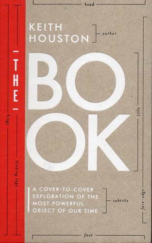
After I retired I saw that one of the community colleges near Seattle was offering evening courses in Papermaking, then Letterpress Printing and finishing with Book Binding and I took advantage. In The Book Keith Houston has followed the same trajectory, writing with another twinkle in his eye, about all aspects of the making of books from the process of making Egyptian papyrus to the modern day. Along the way he talks about the origin of the expression ‘Line in the sand’ and that ‘The Egyptian King Ptolemy clapped the librarian in irons to ensure his continued loyalty’.
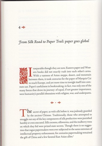
The Book is divided into four main Parts, each consisting of three or four chapters, entitled ‘The Page’, ‘The Text’, ‘Illustrations’ and ‘Form’. The first Part provides a brief history of the development of materials to write on, from Egyptian papyrus through vellum and parchment and onwards. Although vellum is now out of fashion it appears that the Queen’s speech at the opening of the UK’s parliament must be written on it and the latest opening was delayed partly due to a dearth of prepared vellum. The Chinese invented paper; at the Battle of Talas in 751 between the Chinese and the Arabs some Chinese papermakers were captured leading to the diffusion of papermaking through the Arab world.4
Writing and printing are dealt with in the second Part, covering much between the invention of cuneiform around 5000 years ago by the Sumerians and the development of the Linotype and Monotype printing presses in the 19th century.
Part 3, ‘Illustrations’, is mainly concerned with producing pictures in books. The earliest illustration shown is a facsimile from the Egyptian The Book of the Dead of Hunefer where the original is dated to about 1275 bc. Then it rapidly moves on to the magnificent illuminated manuscripts such as the Book of Kells. These were, of course, incredibly expensive, and woodcuts, a technology imported from the East, became a commonplace means of including illustrations within a book. These were followed by etchings which enabled much finer detail to be shown. These were then followed in turn by lithography, photography and now modern book, and magazine, printing technology.
Having made this progression through what might be termed the interior physical components of a book, Part 4 goes into some detail about how they are all assembled into a whole book. This starts off with precursors, such as scrolls, that we now (and I assume then), have found not too comfortable to read.5 Nowadays books are in the form of a ‘codex’, of which The Book is a example. One of the examples used is St Cuthbert Gospel, made at the end of the seventh century. By coincidence for those who are interested, a facsimile of this has recently been created with full details of its construction.6
The Book is set in 11pt Adobe Jenson Pro Light created by Robert Slimbach with some examples of other scripts, such as hieroglyphs, Chinese and Insular. The overall layout is striking as perhaps can be seen from the illustration of the cover and the first page of achapter. Throughout the book all the technical aspects are noted and named as exampled on the cover in black but in gray in the interior. Chapter numbers are followed by an ornament, both printed in red ink, while the chapter titles are black. The first line of each chapter is preceded by a 5-line ornament and a 3-line drop cap, both in red. Sections are initiated by a red section break incorporating a pair of the chapter number ornament; the initial word of the first line consists of a 3-line elevated cap followed by the remaining letters in a font size intermediate between the cap and the body of the text, all in red.
I took the opportunity to show The Book to a group where we were taking letterpress printing and bookbinding courses to see what they thought. The niggles first. The cover appears to be made of some kind of cardboard and by the time everyone had perused it the cover was showing definite signs of wear. There was some 60 plus pages headed ‘Notes’ which to most of us should have been called ‘References’ or ‘Bibliography’ as they did not expand on the text, but rather pointed at other people’s work.
On the bright side the declarations and demonstrations of the technical terms throughout the book were much appreciated by the printers. Several on the courses, including at least one of the instructors, claimed that they would make sure that they would buy a copy of The Book.
I’m looking forward to Keith Houston’s next book. Having written one on the minutiae of writing and another on books, then the obvious next topic will be libraries, but Houston appears to delight in the non-obvious.
The web site ShadyCharacters.co.uk has been set up by Keith Houston so that you can explore and participate in more of his interests.
1I don’t like the * in running text as it makes a dark blob on the page.
2Not to be confused with manciple (a steward) or manacles (o ⌣o).
3I think that my eyesight is good but my wife keeps urging me to see an optician.
4Nowadays there is a Brooklyn-based company called Talas selling supplies for book makers and conservators.
5I have recently bound a ‘book’ in accordion style that when opened extends to 17 feet (5.2m) in length.
6Kathy Sedar, The St Cuthbert Gospel—The Making of a Facsimile, Bookbinder, v. 30, pp. 5–16, 2016.